by Dana Grimaldi, Assistant Editor/Editorial Assistant, Harlequin Heartwarming & Gold Eagle
A good cover does two things: it accurately represents the story and it catches the reader’s eye. At Harlequin, we work hard to make sure all our covers do both!
First, the author fills out an art fact sheet. We ask for a description of the hero and heroine and information about the plot, setting, themes and the story’s hooks. We’ll also ask for a few of the story’s key scenes, because one of those moments could be the perfect cover image.
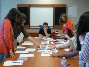
Next up is the art brief, where the art director, editorial team and marketing group go over all the titles in a given month. Each book’s editor talks about what makes that story special and the team decides on which concepts will work best. The group also considers the month’s covers together to make sure there’s variety. Ideally, we’ll have a mix of images: a man or woman alone, a couple, a family, a beautiful setting or even animals.
The art department commissions cover art from in-house and freelance artists. Some covers require a photo shoot and others are created using existing photographs. Once the cover images have been created and approved by marketing and editorial, the text is added and they’re copy edited and proofread.
It’s so exciting to watch a scene description or an art director’s sketch turn into the finished cover! I wanted to give everyone a sneak peek into that process.
Harlequin Heartwarming author Eleanor Jones suggested this scene from her book Footprints in the Sand.
MOOD: A young woman, wild curly golden streaked hair, brown legs, barefoot, walking on the sand. Ahead of her the glittering serenity of the bay, seagulls overhead. A trail of footprints in the sand.
TIME OF DAY/SEASON/WEATHER: Spring
SITUATION/LOCATION: The shore, Jenny Browns bay
OTHER: The focus is on the footprints that are already beginning to fade as the sea washes over them. The girl is lifting her face to the breeze, staring out to sea.
In the art briefing, we talked about showing the hero and heroine together. The art director also decided to crop the image, so we see only the couple’s legs and feet with the footprints. This tight focus gives the image a much stronger impact and works nicely with the title.
Writing is often described as a lonely or solitary pursuit, so I’m glad that making the cover is a group effort. Whoever wins this year’s So You Think You Can Write contest will have a team of passionate experts on their side to help create the perfect cover.
One of my favorite Harlequin covers was created for Orange Blossom Brides by Heartwarming author Tara Randel. (I may be a little biased!)
I’d love to hear about your favorite book covers! Have you ever bought a book just because of its beautiful cover?


